
A Tale of Two Networks
19 May 2015
As part of my fellowship, I’ve had the chance to contribute to two influence mapping projects in South Africa and Mozambique. While both projects focus on finding possible conflicts of interest within a small group of politically exposed persons (PEPs), their approach has been very different.
Modelling a country
In South Africa, the Siyazana project had the goal of collecting and integrating data on members of parliament and the national cabinet. We conducted a mix of manual research, and scraping of declarations of interest from the members of parliament, company records (which we had to buy one by one), NGO board memberships, and about half a dozen other data sources.
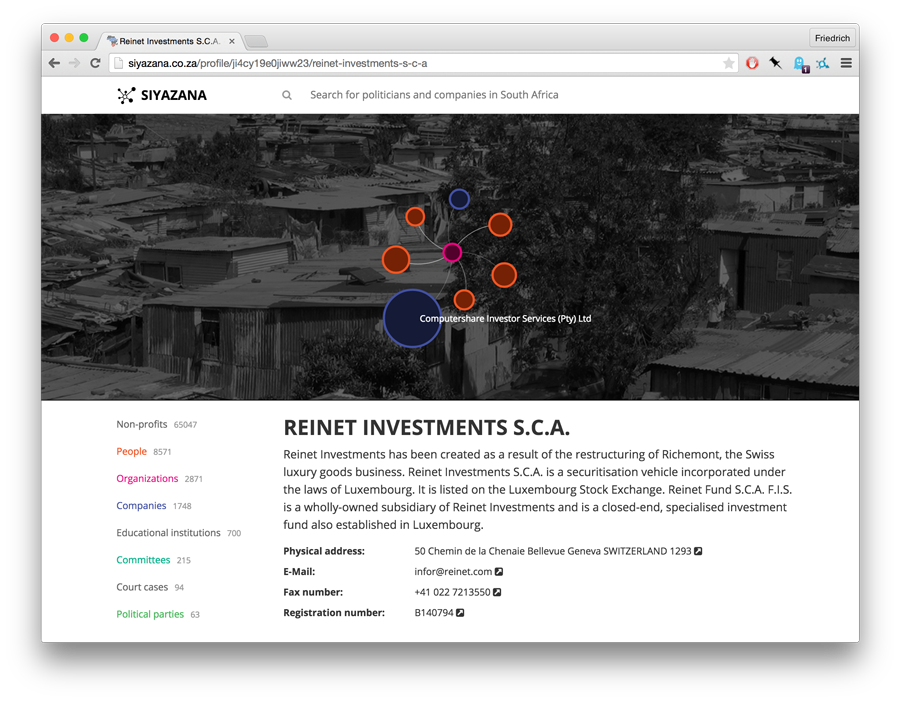
For our project partner, the Institute for Security Studies, the goal to create an accessible resource for research. Having such a coherent fund of data requires a lot of integration work: over 100,000 records on companies, non-profits and persons need to be de-duplicated and checked for their correctness. Even months later, this work is not complete.
Digging for knowledge
Working with Don Hubert on data from Mozambique, I was able to try out another approach: we agreed on a few small research questions we wanted to investigate before we began collecting very much data. This gave us a set of targets towards which we were able to focus the search for data. And we got lucky: machine-readable data both for mining concessions and company records turned out to be available online.
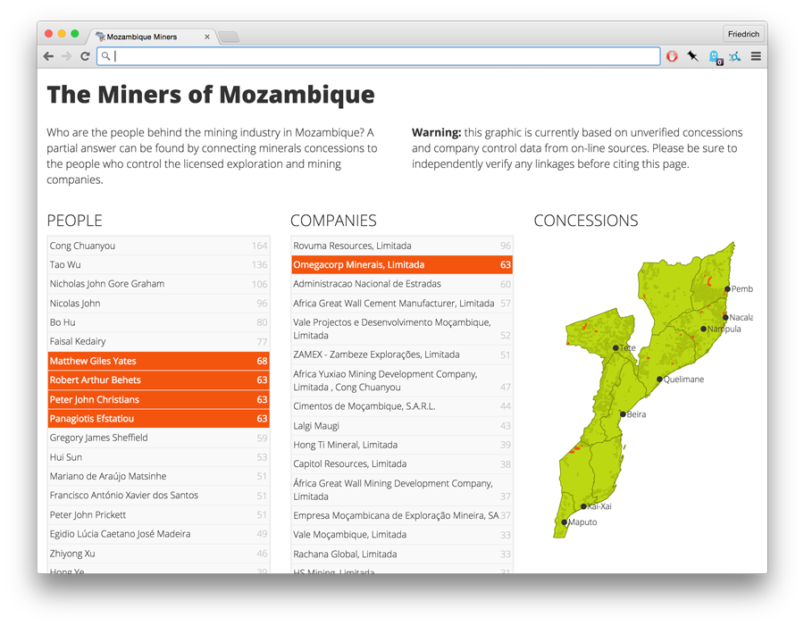
More than that, the research questions proved that there wasn’t actually a need for a browsable user interface: a simple set of result tables and some narrative to explain their limitations are sufficient to explore many of the questions we posed initially. More than that: none of the current generation of open source influence mapping tools would have been much use to get these specific result sets, while traditional SQL queries make it trivial to do so. Having a target also made data integration simpler: rather than working through 100,000s of entries, only the company names in concessions data needed to be matched up - 2,200 in total.
Binders full of people
While it is not possible to compare the impact of both projects (the Mozambique work hasn’t even been published yet) both experiences have convinced me that influence mapping projects must be driven by a set of hypotheses.
Too often, we instead collect random data under the cover of creating “a resource for others”, a cheap trick to try to avoid having to demonstrate it’s value ourselves. Adopting this mindset of collecting data, we will always think that we have too little. It’s only when we begin to analyse it that we inevitably realise that we already have too much - or the wrong thing.
Even worse, quantitative analysis of such stockpile data is doomed to fail: looking at Siyazana as a network, one will find that South African politics consists mainly of NGOs and companies that give gifts to politicians. This is a consequence of the data sources that are available to the project. Such biases mean that most analysis will reflect our collection procedures, but hardly ever tell us anything about the problems in our society.
Bulk company information might be the sole exception to this anti-stockpiling rule: it’s always useful. As a recurring theme of our work at ANCIR, and also the projects I’ve been involved in with other groups: company data is the spine of influence mapping.
Data to serve a purpose
The recognition that, in data journalism, the story idea should drive data collection isn’t new. The point is most often made with regards to data presentation: visualisations aren’t meant to present the data for it’s own sake, but make a relevant point in the context of an analysis.
But following this rule is difficult when the source data requires a significant amount of work to acquire and clean. The natural instinct is to proudly present the assets that we have created, rather than embarking on a second journey to interpret them. Great pieces of influence mapping, however, do just that: whether by structuring influence ties in Chinese politics, or by presenting the biographies of US presidential campaign staff.